\(\newcommand{L}[1]{\| #1 \|}\newcommand{VL}[1]{\L{ \vec{#1} }}\newcommand{R}[1]{\operatorname{Re}\,(#1)}\newcommand{I}[1]{\operatorname{Im}\, (#1)}\)
Thresholding with false discovery rate
Written with J-B Poline.
The false discovery rate is a different type of correction than family-wise correction. Instead of controlling for the risk of any tests falsely being declared significant under the null hypothesis, FDR will control the number of tests falsely declared significant as a proportion of the number of all tests declared significant.
A basic idea on how the FDR works is the following.
We have got a large number of p values from a set of individual tests. These might be p values from tests on a set of brain voxels.
We are trying to a find a p value threshold \(\theta\) to do a reasonable job of distinguishing true positive tests from true negatives. p values that are less than or equal to \(\theta\) are detections and \(\theta\) is a detection threshold.
We want to choose a detection threshold that will only allow a small number of false positive detections.
A detection can also be called a discovery; hence false discovery rate.
For the FDR, we will try to find a p value within the family of tests (the set of p values), that we can use as a detection threshold.
Let’s look at the p value for a particular test. Let’s say there are \(N\) tests, indexed with \(i \in 1 .. N\). We look at a test \(i\), and consider using p value from this test as a detection threshold; \(\theta = p(i)\). The expected number of false positives (FP) in N tests at this detection threshold would be:
For example, if we had 100 tests, and the particular p value \(p(i)\) was 0.1, then the expected number of false positive detections, thresholding at 0.1, is 0.1 * 100 = 10.
Let’s take some data from a random normal distribution to illustrate:
>>> import numpy as np
>>> import matplotlib.pyplot as plt
Hint
If running in the IPython console, consider running %matplotlib to enable
interactive plots. If running in the Jupyter Notebook, use %matplotlib
inline.
>>> np.random.seed(42) # so we always get the same random numbers
>>> N = 100
>>> z_values = np.random.normal(size=N)
Turn the Z values into p values:
>>> import scipy.stats as sst
>>> normal_distribution = sst.norm(loc=0,scale=1.) #loc is the mean, scale is the variance.
>>> # The normal CDF
>>> p_values = normal_distribution.cdf(z_values)
To make it easier to show, we sort the p values from smallest to largest:
>>> p_values = np.sort(p_values)
>>> i = np.arange(1, N+1) # the 1-based i index of the p values, as in p(i)
>>> plt.plot(i, p_values, '.')
[...]
>>> plt.xlabel('$i$')
<...>
>>> plt.ylabel('p value')
<...>

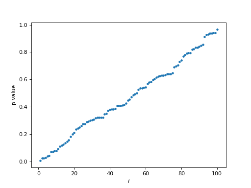
Notice the (more or less) straight line of p value against \(i\) index in this case, where there is no signal in the random noise.
We want to find a p value threshold \(p(i)\) where there is only a small proportion of false positives among the detections. For example, we might accept a threshold such that 5% of all detections (discoveries) are likely to be false positives. If \(d\) is the number of discoveries at threshold \(\theta\), and \(q\) is the proportion of false positives we will accept (e.g. 0.05), then we want a threshold \(\theta\) such that \(E(FP) / d < q\) where \(E(x)\) is the expectation of \(x\), here the number of FP I would get on average if I was to repeat my experiment many times.
So - what is \(d\) in the plot above? Now that we have ordered the p values, for any index \(i\), if we threshold at \(\theta \le p(i)\) we will have \(i\) detections (\(d = i\)). Therefore we want to find the largest \(p(i)\) such that \(E(FP) / i < q\). We know \(E(FP) = N p(i)\) so we want the largest \(p(i)\) such that:
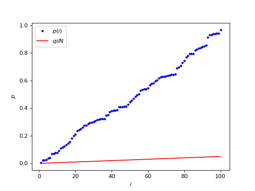
Let’s take \(q\) (the proportion of false discoveries = detections) as 0.05. We plot \(q i / N\) (in red) on the same graph as \(p(i)\) (in blue):
>>> q = 0.05
>>> plt.plot(i, p_values, 'b.', label='$p(i)$')
[...]
>>> plt.plot(i, q * i / N, 'r', label='$q i / N$')
[...]
>>> plt.xlabel('$i$')
<...>
>>> plt.ylabel('$p$')
<...>
>>> plt.legend()
<...>

Our job is to look for the largest \(p(i)\) value (blue dot) that is still underneath \(q i / N\) (the red line).
The red line \(q i / N\) is the acceptable number of false positives \(q i\) as a proportion of all the tests \(N\). Further to the right on the red line corresponds to a larger acceptable number of false positives. For example, for \(i = 1\), the acceptable number of false positives \(q * i\) is \(0.05 * 1\), but at \(i = 50\), the acceptable number of expected false positives \(q * i\) is \(0.05 * 50 = 2.5\).
Notice that, if only the first p value passes threshold, then \(p(1) < q \space 1 \space / \space N\). So, if \(q = 0.05\), \(p(1) < 0.05 / N\). This is the Bonferroni correction for \(N\) tests.
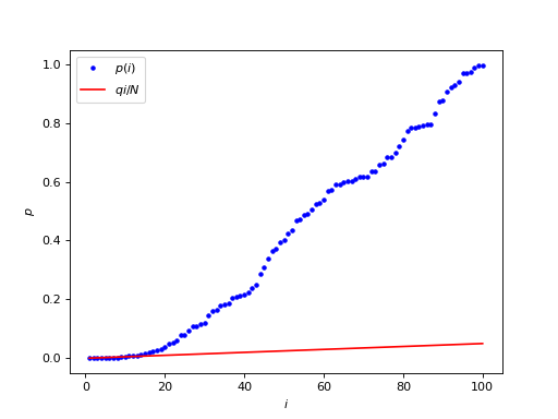
The FDR becomes more interesting when there is signal in the noise. In this case there will be p values that are smaller than expected on the null hypothesis. This causes the p value line to start below the diagonal on the ordered plot, because of the high density of low p values.
>>> N_signal = 20
>>> N_noise = N - N_signal
>>> noise_z_values = np.random.normal(size=N_noise)
>>> # Add some signal with very low z scores / p values
>>> signal_z_values = np.random.normal(loc=-2.5, size=N_signal)
>>> mixed_z_values = np.sort(np.concatenate((noise_z_values, signal_z_values)))
>>> mixed_p_values = normal_distribution.cdf(mixed_z_values)
>>> plt.plot(i, mixed_p_values, 'b.', label='$p(i)$')
[...]
>>> plt.plot(i, q * i / N, 'r', label='$q i / N$')
[...]
>>> plt.xlabel('$i$')
<...>
>>> plt.ylabel('$p$')
<...>
>>> plt.legend()
<...>

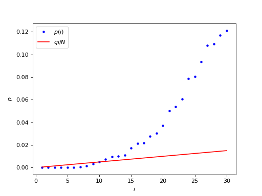
The interesting part is the beginning of the graph, where the blue p values stay below the red line:
>>> first_i = i[:30]
>>> plt.plot(first_i, mixed_p_values[:30], 'b.', label='$p(i)$')
[...]
>>> plt.plot(first_i, q * first_i / N, 'r', label='$q i / N$')
[...]
>>> plt.xlabel('$i$')
<...>
>>> plt.ylabel('$p$')
<...>
>>> plt.legend()
<...>

We are looking for the largest \(p(i) < qi/N\), which corresponds to the last blue point below the red line.
>>> below = mixed_p_values < (q * i / N) # True where p(i)<qi/N
>>> max_below = np.max(np.where(below)[0]) # Max Python array index where p(i)<qi/N
>>> print('p_i:', mixed_p_values[max_below])
p_i: 0.00323007466783
>>> print('i:', max_below + 1) # Python indices 0-based, we want 1-based
i: 9
The Bonferroni threshold is:
>>> 0.05 / N
0.0005
In this case, where there is signal in the noise, the FDR threshold adapts to the presence of the signal, by taking into account that some values have small enough p values that they can be assumed to be signal, so that there are fewer noise comparisons to correct for, and the threshold is correspondingly less stringent.
As the FDR threshold becomes less stringent, the number of detections increases, and the expected number of false positive detections increases, because the FDR controls the proportion of false positives in the detections. In our case, the expected number of false positives in the detections is \(q i = 0.05 * 9 = 0.45\). In other words, at this threshold, we have a 45% chance of seeing a false positive among the detected positive tests.
So, there are a number of interesting properties of the FDR - and some not so interesting if you want to do brain imaging.
In the case of no signal at all, the FDR threshold will be the Bonferroni threshold
Under some conditions (see Benjamini and Hochberg, JRSS-B 1995), the FDR threshold can be applied to correlated data
FDR is an “adaptive” threshold
Not so “interesting”
FDR can be very variable
When there are lots of true positives, and many detections, the number of false positive detections increases. This can make FDR detections more difficult to interpret.