Plotting
Take home message for the lazy
To use plotting in a Notebook, add the following cell:
import matplotlib.pyplot as plt
% matplotlib inline
Then use commands like plt.hist(data) and plt.scatter(x_data, y_data).
In more detail
Matplotlib is a popular plotting library for Python.
In particular, there is a sub-module of Matplotlib, that has many useful plotting functions.
You can import this in the usual way:
>>> import matplotlib.pyplot
>>> type(matplotlib.pyplot)
<class 'module'>
By default, Matplotlib likes to make a new window for each plot. That’s not what we want in the Notebook, because we want the plots to appear inside the Notebook. To make that happen we use a special command in the Notebook, like this:
%matplotlib inline
Once we’ve done this, the plot come up inside the Notebook, and can be stored with the notebook.
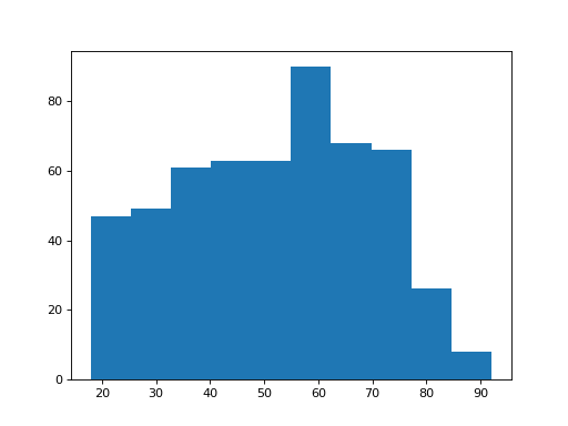
Here’s an example histogram from the Where are the Brexiteers? data. I’m using Pandas to load the data, but that’s only to get the data; it is not important for the plotting:
>>> # Get the data - don't worry about the details of this cell
>>> import pandas
>>> remain_leave = pandas.read_csv('remain_leave.csv')
>>> leavers_ages = remain_leave.loc[remain_leave['brexit'] == 2, 'age']
>>> # Do a default histogram of the leavers' ages
>>> matplotlib.pyplot.hist(leavers_ages)
<...>

It is boring to have to type matplotlib.pyplot.hist when you want a
histogram, so we often make a shortcut to the plt module, like this:
>>> # Make a shortcut to the pyplot submodule, and use it
>>> plt = matplotlib.pyplot
>>> plt.hist(leavers_ages)
<...>
In fact, there’s a shortcut to making the shortcut, which is to rename the submodule when we import it. That looks like this:
>>> # Import the pyplot submodule with it's own shortcut
>>> import matplotlib.pyplot as plt
>>> plt.hist(leavers_ages)
<...>

You’ll see this command import matplotlib.pyplot as plt in a lot of code
online, it’s a very popular idiom.
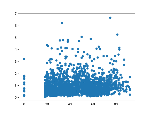
Another useful plot is a scatterplot. Here I go back to the Brexit questionnaire, and plot the persons age (on the x axis) against a weighting score used in the survey:
>>> # Get all the data again
>>> audit_data = pandas.read_table('audit_of_political_engagement_14_2017.tab')
>>> plt.scatter(audit_data['numage'], audit_data['wts'])
<...>